The Haptic Void: Why "Perfect" Prints Fail in Rigid Box Production
It usually happens at the worst possible moment: the "Golden Sample" review. The client, a jewelry founder who has spent six months obsessing over pantone codes on a Retina 5K display, picks up the physical prototype.
They don’t look at it first. They touch it.
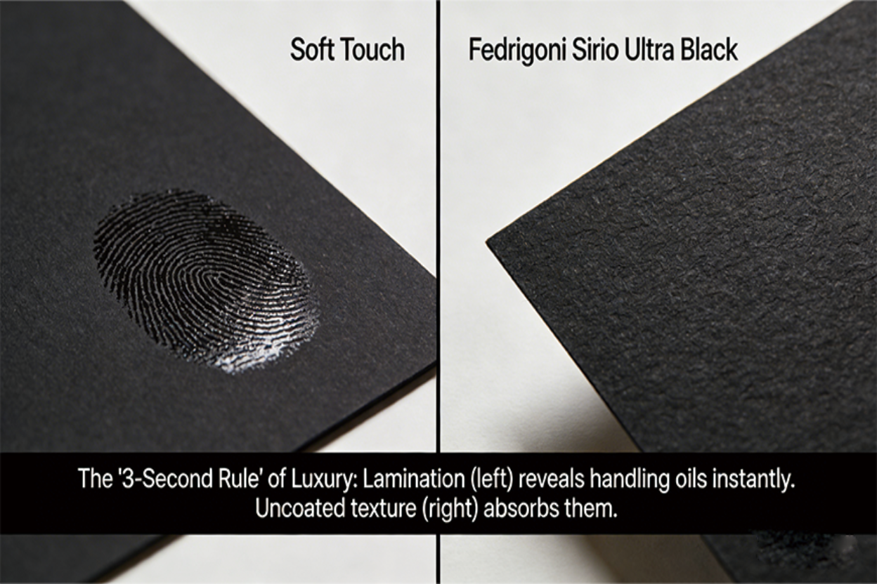
And immediately, the illusion collapses. The "Soft Touch" matte lamination—which looked like velvet in the render—instantly collects a greasy smear of fingerprints. The complex four-color black print, intended to look like obsidian, reveals a microscopic hairline crack of white paper at the corner where the fold stress was too high. The box feels light, not in an aerodynamic way, but in a hollow, cheap way. It feels like plastic.
This is the "Retina Lie." We are designing in a vacuum of perfect pixels, but manufacturing in a chaotic world of physics, friction, and fiber.

For independent brands and high-end procurement managers, the instinct is to engineer luxury through addition: add a lamination layer, add a Spot UV, add a complex foil pattern, add a bevel. This is a mistake. In the rigid box supply chain, luxury is not about how many processes you can stack; it is about the integrity of the substrate.
This guide dissects why shifting budget from "printing effects" to "specialty papers" is not an aesthetic preference—it is a risk mitigation strategy.
The Engineering Reality of "Coated" vs. "Uncoated"
Let's strip away the marketing fluff. Most "premium" packaging failures stem from a fundamental misunderstanding of the base material.
The industry standard—the default option your supplier will push because it’s cheap and easy to run—is 157gsm C2S (Coated 2 Sides) Art Paper. It is a soulless, chemically sealed sheet designed to sit on top of ink. When you wrap a rigid box in this, you are essentially wrapping it in a thin layer of clay and plastic.
The "Plasticity" Problem
When you print a full-bleed background color on C2S paper and then laminate it (which you must, to prevent cracking), you create a barrier.
- Thermal Insulation: The box feels room temperature or slightly warm to the touch. It lacks the "coolness" of natural materials.
- Acoustic Damping: When the consumer runs their fingernail across it, it screeches or slides silently. It lacks friction.
Compare this to a dyed-through uncoated stock (like Fedrigoni Sirio or G . F Smith Colorplan). These papers are not sealed. The fibers are exposed.
- Micro-friction: When a finger glides over high-quality uncoated paper, there is a microscopic level of drag. This resistance signals "substance" to the human brain.
- Light Absorption: Texture "eats" light. While a matte laminated box reflects a diffused glare (making blacks look dark grey), a textured black paper traps light between the fibers, creating a "void" black that print can rarely achieve.
The Engineering Trade-off:
Using C2S paper allows for high-resolution photo printing. But ask yourself: Does your luxury jewelry box need a photograph of a model on it? Or does it need to embody the permanence of the stone inside? If it’s the latter, C2S is the wrong material.
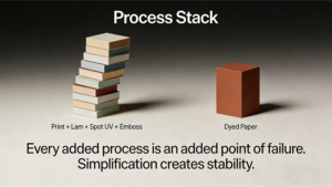
The Hidden Cost of "Process Stacking"
There is a prevalent myth in procurement: Standard paper is cheap ($), specialty paper is expensive ($$$).
Therefore, to save money, we should buy standard paper and print the color/texture on it.
This is False Economy. It ignores the concept of Total Manufacturing Risk.
Every time you add a post-processing step to a cheap sheet of paper to make it look expensive, you introduce a variable that can fail.
The Failure Cascade
Let’s look at a typical "Faux Luxury" spec vs. a "Minimalist Material" spec.
| Feature | The "Faux Luxury" Route (Process Stacking) | The "Material First" Route (Substrate Integrity) |
|---|---|---|
| Base Material | Cheap 157gsm Art Paper (White) | 120gsm Solution-Dyed Textured Paper |
| Coloring | Full bleed offset print (4 passes) | Zero (Paper is already colored) |
| Protection | Matte BOPP Lamination (1 pass) | Zero (Paper is abrasion resistant) |
| Texture | Embossing cylinder (1 pass) | Zero (Texture is intrinsic) |
| Branding | Hot Foil Stamping | Hot Foil Stamping |
| Total Passes | 7+ Machine Passes | 2 Machine Passes (Die-cut + Foil) |
| Risk Factor | High. Dust under lamination. Print color variance (ΔE > 3). Registration errors between print and emboss. | Low. Material consistency is guaranteed by the paper mill. |
| True Cost | High Setup Fees + High Reject Rate (10-15%) | Higher Material Cost + Low Reject Rate (<2%) |
The Reality Check:
When you print a leather texture on paper, it looks fake because the light doesn't interact with the physical topography of the sheet. When you emboss a leather texture on cheap paper, the pressure often flattens the internal fiber structure, weakening the paper at the corners.
By choosing a specialty paper where the texture is created during the pulping process (felt-marked) or physically pressed into the raw fibers (embossed), you eliminate the need for printing and laminating. You pay more for the paper, but you pay significantly less for machine time and setup.
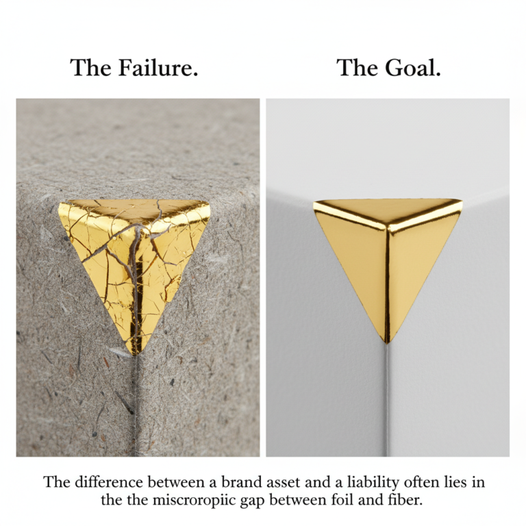
The "White Edge" Nightmare
If there is one detail that screams "amateur," it is the Cracked Spine.
Rigid boxes are formed by wrapping paper around greyboard (chipboard). The paper must make a 90-degree turn over the edge of the board.
Scenario A: Printed Black (The Trap)
You print 100% Black on white paper. The ink sits on the surface. When the wrapping machine pulls the paper tight over the corner of the box, the paper fibers stretch. The ink layer, which is brittle, breaks.
- Result: A jagged white line appears along every edge of your black box.
- The Band-aid: Factories will try to fix this with a permanent marker on the assembly line. Yes, really. It looks as bad as it sounds.
Scenario B: Solution-Dyed Paper (The Fix)
"Solution-dyed" (or vat-dyed) means the pulp was dyed black in the beater before the paper was made. The paper is black all the way through.
- Result: If the paper stretches, it reveals... more black fibers. If the box gets scratched during shipping, the scratch is black, not white.
- Sensory Metaphor: Think of it like a scratch on a painted car bumper (reveals the plastic underneath) vs. a scratch on a piece of solid mahogany (reveals more wood). Luxury is about homogeneity.
V-Grooving and the "Sharpness" Index
Minimalism demands precision. A sloppy minimalist box is just a plain box. The defining feature of modern luxury packaging is the Sharp Edge, achieved through V-Grooving.
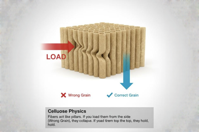
Standard rigid boxes use "score and fold," resulting in rounded, bulbous edges. V-Grooving removes a wedge of material from the greyboard, allowing it to fold into a razor-sharp 90-degree angle.
However, this process introduces a critical dependency on paper quality.
The Corner Tear Risk
A V-grooved box has zero radius at the corner. The wrapping paper must be exceptionally strong to withstand this tension without snapping.
- Recycled Paper: Short fibers. Brittle. Often cracks at the V-groove.
- Virgin Pulp Specialty Paper: Long fibers. High tensile strength. Wraps tightly around the sharp corner without breaking.
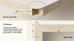
Adversarial Warning: If your factory tells you they can't do V-grooving with a specific textured paper, they are usually lying to save costs. However, some extremely deep textures (like heavy buckram) do resist folding. In these cases, experienced engineers will "deboss" the fold lines before wrapping to flatten the texture at the stress point.
The Acoustics of Unboxing (Suction & Fit)
We rarely talk about sound in design specs, but we notice it.
When a consumer lifts the lid of a premium rigid box (telescope style), there should be a moment of resistance. The lid shouldn't fall off; it should slide.
This is the "Pneumatic Effect." It relies on air being trapped between the lid and the base, escaping slowly.
- The Glossy/Laminated Box: The plastic surface creates a seal that is often too tight, creating a vacuum lock where the customer has to shake the box to open it. Or, if the tolerance is loose, it slides off instantly with a clatter.
- The Textured Box: Textured paper allows microscopic airflow between the fibers. This creates a consistent, dampened sliding action. It feels controlled. It creates a "Whoosh" rather than a "Pop."
Tolerances: The "Air Gap" for a textured box needs to be calculated differently. You cannot use the same die-cut templates for a 120gsm smooth stock and a 120gsm felt-marked stock. The textured stock has a higher "bulk" (volume). If the factory doesn't adjust the gap, the lid will jam.
Forensic Q&A: The Brutal Truths
I have simulated a conversation with a skeptical Production Manager to address the questions usually whispered in the corridor after the design presentation.
Q: "This paper has a deep canvas texture. Won't the foil stamping look terrible? It usually bridges across the gaps and flakes off."
A: This is a legitimate risk, but it's a solved problem. You cannot use standard "flat" foil dies. You must specify a "Fluted" or "Textured" Foil Die. This drives the foil into the grain of the paper rather than just laying it on top. Alternatively, increase the heat and pressure (dwell time) and use a foil formulated for porous substrates (like Kurz Luxor/Alufin series for uncoated stocks). If your factory says it can't be done, they are using cheap dies.
Q: "We sell in humid climates (Singapore, Florida). Uncoated paper absorbs moisture. Won't the boxes warp?"
A: Yes, paper is hygroscopic. However, warping is usually caused by asymmetry. If you wrap the outside of the greyboard with expensive uncoated paper and line the inside with cheap coated paper, they will expand/contract at different rates, turning your box into a banana. The fix: Balance the construction. Use a liner paper with similar GSM and grain direction to the face paper. The "sandwich" must be balanced.
Q: "This sounds expensive. How do I sell a 40% increase in unit cost to the CEO?"
A: You aren't selling a unit cost increase. You are selling a reduction in damages.
- Fact: Laminated matte black boxes have a scratch/scuff reject rate of roughly 15-20% in retail environments.
- Fact: Dyed-through textured boxes hide dust and minor abrasions.
- The Pitch: "We can pay $2.00 for a box that looks perfect on day one and trash on day seven, or $2.60 for a box that looks 95% perfect for three years."
Q: "Can't we just use 'Soft Touch' varnish instead of lamination to avoid the plastic feel?"
A: You can, but you shouldn't. Soft Touch varnish over dark ink is the most fragile finish in the industry. It scratches if you look at it wrong. It also degrades (becomes sticky) over time in storage. If you want tactile softness, use a paper with high cotton content (like Neenah Cotton). That softness is physical, not chemical.
Q: "My logo is very fine/intricate. The texture will distort it."
A: Correct. Minimalism requires discipline. If your logo has 0.5pt lines, it was designed for a website, not a textured box. You have two choices:
- Modify the Art: Thicken the strokes for the packaging application (Technical requirement: usually >0.2mm for foil on textured stock).
- Deboss First: Create a smooth "patch" by debossing a blind square, then foil stamp inside that smooth area. This creates a beautiful "label" effect without adding material.
Summary: The Discipline of Restraint
Designing with specialty papers is harder than designing with print.
With print, you can hide bad structural design with a busy pattern.
With textured paper, there is nowhere to hide. The alignment of the V-groove, the corner wrapping, the gap between lid and base—everything is exposed.
But when it works, it bypasses the consumer's skepticism. We have been trained to ignore ads and flashy graphics. We have not yet been trained to ignore the feeling of genuine fiber friction or the density of a solid-dyed material.
Stop trying to print luxury. Build it.